You built a polished HoneyBook form, copied the official embed code, dropped it into an Elementor HTML widget, and expected the thing to behave. Instead, the form sits slightly off-center on desktop, the Submit button hangs out near the far-right corner, and your mobile page slides sideways like somebody greased the floor. It is a small problem with an impressive ability to make an otherwise professional website feel broken.
If you searched for “HoneyBook form horizontal scroll on mobile in Elementor,” you are dealing with the exact issue I recently fixed on my own website. The HoneyBook embed was becoming wider than its Elementor Container, creating horizontal overflow on phones and inconsistent alignment across screen sizes. The problem was not the design of the form inside HoneyBook. It was how the external form interacted with Elementor’s layout.
This issue matters because mobile is not an optional side dish anymore. StatCounter measured mobile devices at 52.57% of worldwide web traffic in July 2026, compared with 45.93% for desktop and 1.5% for tablets. When your contact form breaks on mobile, you could be putting unnecessary friction in front of more than half your potential leads. StatCounter Global Stats
The good news is that you do not need another WordPress plugin, a replacement form, or a six-hour date with Elementor support forums. The fix is a responsive CSS wrapper that keeps the HoneyBook form embed inside its Elementor Container. I tested this approach on a live HoneyBook form and adjusted the Elementor Container widths for desktop, tablet, and mobile.

What This Elementor Tutorial Covers
This guide fixes the actual width problem instead of tossing random alignment settings at the page and hoping one of them sticks. We will constrain the HoneyBook form embed, remove the mobile horizontal scroll, center the form, and bring the desktop Submit button back from the wilderness. We will also preserve the form’s automatic vertical height so longer questions and validation messages are not cut off.
The fix works by separating two responsibilities. Elementor controls the width and placement of the parent Container, while the HoneyBook form wrapper and injected iframe remain at 100% of that available space. Once those layers stop arguing about who owns the width, the form behaves properly.
Here is what we will cover:
- Why HoneyBook forms can overflow Elementor Containers.
- The responsive wrapper code you can copy and paste.
- Where to place the code inside Elementor.
- The best Elementor Container widths for each device.
- Why generic vertical-centering advice does not solve the problem.
- How to fix the Submit button appearing too far right.
- Common fixes that can make the problem worse.
- How to troubleshoot any remaining mobile overflow.
- Frequently asked questions about HoneyBook and Elementor.
The quick fix comes first because nobody searching for an answer wants to dig through a novel before seeing the code. Afterward, we will break down what each piece does and how to configure Elementor around it. You will know why the fix works instead of blindly pasting another mystery snippet from the internet.
The Fast HoneyBook and Elementor Fix
The basic solution is to wrap your complete HoneyBook form embed inside a responsive <div>. That wrapper stays within the width supplied by Elementor, while the HoneyBook content and iframe fill the wrapper instead of widening the entire page. A horizontal-overflow rule provides a final boundary around the external widget.
Before changing anything, copy your original HoneyBook form embed code into a plain-text backup. Do not use code from someone else’s form because the placeholder class and script contain identifiers connected to your HoneyBook account. Your original embed stays intact; we are simply placing a responsive shell around it.
Paste the following inside the Elementor HTML widget that contains your HoneyBook form:
<style>
  .hb-embed-shell {
    box-sizing: border-box;
    width: 100%;
    max-width: 100%;
    min-width: 0;
    margin-inline: auto;

    /* Fallback followed by the modern overflow value */
    overflow-x: hidden;
    overflow-x: clip;
  }

  .hb-embed-shell > div {
    width: 100% !important;
    max-width: 100% !important;
    min-width: 0 !important;
    margin-inline: auto !important;
  }

  .hb-embed-shell iframe {
    display: block !important;
    box-sizing: border-box !important;
    width: 100% !important;
    max-width: 100% !important;
    min-width: 0 !important;
    margin-inline: auto !important;
    border: 0;
  }
</style>

<div class="hb-embed-shell">

  <!-- Paste your complete original HoneyBook embed code here -->

</div>
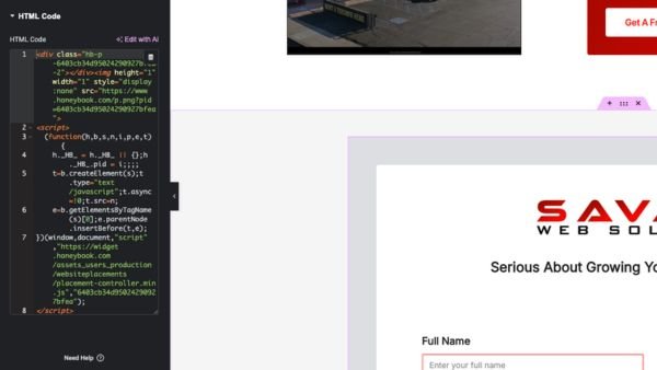
Place your entire original HoneyBook form embed where the comment appears. That includes the HoneyBook placeholder <div>, the hidden tracking image, and the JavaScript supplied by HoneyBook. Do not replace your unique form ID, change the script address, or rewrite the JavaScript because it looks untidy.
The wrapper uses width: 100% to fill the space Elementor provides. The max-width: 100% rule prevents it from becoming wider than that space, while min-width: 0 allows it to shrink when placed inside Elementor’s Flexbox layout. Those three rules do most of the real work.
The margin-inline: auto rule keeps the wrapper centered whenever its Elementor parent gives it less than the full page width. The iframe receives the same width constraints because HoneyBook can generate or update that element after the page initially loads. The !important declarations make the responsive rules strong enough to override conflicting inline width values.
The two overflow-x declarations are intentional. hidden provides a broadly supported fallback, while clip prevents horizontal overflow from creating a scrollable area in browsers that support it. MDN defines overflow-x as the property controlling what happens when content exceeds the left or right edges of an element. MDN: overflow-x
If this fixes the problem, brilliant! You just solved it without installing a plugin whose only apparent purpose is adding another update notification. If the form still overflows or another Elementor section is causing the problem, I can inspect the page and fix the underlying website issue.
Why HoneyBook Forms Can Overflow Elementor
HoneyBook describes its contact form as a customizable widget that can be embedded on a company website or shared through a direct link. The embed code loads form content managed by HoneyBook inside a space created by your website. HoneyBook contact form documentation
Elementor controls the outer structure: the Section or Container, its maximum width, padding, alignment, and the HTML widget holding the code. HoneyBook controls the form experience loaded through the embed. When the external content demands more width than Elementor provides, the browser does not politely negotiate, it allows something to overflow.
This produces a confusing situation where the Elementor Container itself can be centered while the HoneyBook form still looks off-center. Clicking Elementor’s center-alignment button repeatedly does not fix a child element that is physically wider than its parent. Alignment determines where something sits, while width determines whether it fits.
The problem becomes more obvious on mobile because the available viewport is much narrower. An embed exceeding a desktop Container by 40 pixels might only look slightly crooked. The same behavior on a 390-pixel phone can push the entire page sideways and create a visible horizontal scrollbar.
Elementor’s editor can also disguise the issue. The editor sidebar, responsive preview frame, cached styles, and breakpoint settings affect the available preview space. A form can look acceptable inside Elementor and then behave differently on the published page.
That is why testing the live URL matters. Elementor’s responsive mode is useful, but it is not the final authority on how Safari or Chrome will render the page on a physical phone. The published website is where the truth lives, and the truth is rarely impressed by how good something looked in the editor.
Why the Generic Flexbox “Fix” Made My Desktop Form Look Mobile
Before finding the responsive-width fix, I tried the generic advice Google’s AI suggested: place the HoneyBook form embed inside a Flexbox Container using align-items: center, justify-content: center, and a fixed minimum height. It sounded reasonable, but it solved the wrong problem. Instead of properly centering the desktop form, it made the entire HoneyBook form display like its mobile version, even on a full-size desktop screen.
The most likely reason is that HoneyBook determines its responsive layout using the width available to the embedded form, not simply the width of the browser window. Flexbox centered the embed, but it did not guarantee that HoneyBook’s placeholder and injected iframe received the full width of the Elementor Container. Once that internal space became narrow enough, HoneyBook stacked the fields as though the visitor were using a phone.
This is the part generic centering advice tends to miss. justify-content: center controls where a Flexbox child sits, but it does not automatically make that child fill the available width. Meanwhile, min-height: 600px only creates vertical space. It does nothing to correct an iframe that is too wide, too narrow, or ignoring its parent’s dimensions.
The tested fix handles width directly. It forces the outer shell, HoneyBook placeholder, and iframe to use width: 100%, max-width: 100%, and min-width: 0, while Elementor’s parent Container determines the actual desktop, tablet, and mobile widths. That keeps the proper desktop field layout, prevents mobile horizontal scrolling, and avoids creating a giant empty section around the form.
How to Add the Fix in Elementor
Open the WordPress page in Elementor and use the Navigator to locate the HTML widget containing your HoneyBook form code. The widget will usually sit inside a Container, which may itself be nested inside another parent Container. Understanding that nesting is important because every parent can influence the final width.
Elementor’s official documentation confirms that the HTML widget supports HTML, CSS, shortcodes, and JavaScript. That means you can keep the <style> block and HoneyBook embed together in the same widget without installing a separate code plugin. Elementor HTML widget documentation
First, copy the existing HoneyBook form code into a backup. Add the <style> block above it, place <div class="hb-embed-shell"> immediately before the original embed, and add the closing </div> after the full HoneyBook script. Be careful not to close the wrapper in the middle of the original code.
Update the page and clear any cache created by WordPress, Elementor, your hosting provider, or a performance plugin. Open the published URL in a private browser window so you are less likely to receive a logged-in or cached version. Then test the form at multiple screen widths.
If your Elementor installation provides a Custom CSS field, you can move the CSS there later. Keep the .hb-embed-shell wrapper in the HTML widget and keep the HoneyBook form script untouched. Elementor supports adding custom CSS at different scopes, but limiting this fix to the specific form is safer than applying it across the entire website. Elementor Custom CSS documentation
The all-in-one HTML widget method is usually the easiest version to document and maintain. If the form ever needs to be moved, the responsive styles move with it. Nobody has to remember that one essential rule is hiding in an unrelated global stylesheet six months later.
The Best Elementor Container Widths
Once the HoneyBook form embed respects its parent, use Elementor’s responsive controls to decide how wide the form should appear. Do not use the CSS shell to create the desktop presentation width. The shell should stay at 100% and let Elementor’s parent Container handle the layout.
For the form tested in this article, the following Elementor settings created a balanced result:
- Desktop parent Container:
60% - Tablet parent Container:
95% - Mobile parent Container:
100% - HTML widget:
100% - HoneyBook shell:
100% - HoneyBook iframe:
100% - Optional desktop maximum width: approximately
1100px
Select the parent Container in Elementor, switch between desktop, tablet, and mobile modes, and set the width for each breakpoint. Depending on your Elementor version, the control may appear under Layout, Advanced, or the newer Style sizing controls. Make sure you are changing the correct parent Container rather than an unrelated outer Section.
Center the parent Container horizontally after assigning the desktop width. You can use Elementor’s alignment controls or automatic left and right margins, depending on the surrounding structure. A 60%-wide Container aligned to the left is still a 60%-wide Container aligned to the left.
Elementor’s size controls can define minimum, maximum, and regular width values while also controlling overflow behavior. The exact labels differ between Elementor versions, but the underlying idea remains the same: create a centered parent with a deliberate width, then let the HoneyBook form embed fill that parent. Elementor size and overflow documentation
Avoid setting both the Elementor parent and .hb-embed-shell to 60%. The shell would become 60% of a parent that is already 60% of the page, resulting in a form that occupies only 36% of the available page width. That is not responsive design; that is a contact form being slowly crushed by arithmetic.
Fixing the Submit Button in the Far-Right Corner
After solving the mobile overflow, you may notice that the HoneyBook form Submit button sits near the far-right edge on a wide desktop monitor. That does not mean the responsive CSS failed. It generally means the HoneyBook form fills a very wide Elementor Container and places the button at the right edge of its internal layout.
The clean solution is to reduce and center the Elementor parent Container on desktop. A width around 60%, combined with an optional maximum width, pulls the entire form inward. The button remains right-aligned inside HoneyBook, but the right edge of the form is no longer sitting near the edge of the browser.
Tablet can use approximately 95% because it needs more of the available screen width. Mobile should use 100% so fields, labels, checkboxes, and the Submit button have enough room. Elementor’s responsive controls are better for these presentation widths than repeating the same breakpoints inside your custom CSS.
Trying to target and center the HoneyBook form Submit button directly from Elementor may not work. The button can live inside externally loaded content that is isolated from the parent website’s CSS. Control the form’s outer width in Elementor and use HoneyBook’s design settings for supported button styling.
Common Fixes That Can Make the Problem Worse
The first bad fix is adding overflow-x: hidden to the entire website and declaring the case closed. A global rule can remove the scrollbar while leaving an element wider than the viewport. It hides the evidence without correcting the layout.
The second bad fix is forcing a fixed height on the HTML widget or parent Container. HoneyBook forms can display validation messages, additional questions, and confirmation content after the visitor interacts with them. A fixed height that looks fine during one test can cut off actual leads halfway through the process.
The third bad fix is adding more Flexbox Containers until the form appears centered by accident. Elementor relies heavily on Flexbox, but display: flex does not automatically make oversized children shrink. Width, maximum width, minimum width, padding, and overflow still determine whether the child fits.
The fourth bad fix is using width: 100vw on the HoneyBook form widget. Viewport width can ignore the practical width of a padded Elementor Container and may interact badly with scrollbars or nested layouts. Use width: 100% when the form should fit inside an existing parent.
The fifth bad fix is trying to restyle every HoneyBook field using Elementor CSS. External iframe content may not accept selectors from the parent website. Use HoneyBook’s own design controls for its internal fonts, colors, input borders, backgrounds, and button styling.
The sixth bad fix is installing another plugin before inspecting the layout. Plugins cannot magically resolve a disagreement between an external embed and a poorly constrained Container. Start with the element causing the overflow, then expand the investigation only if the problem remains.
Troubleshooting Remaining Horizontal Scroll
If your Elementor page still moves sideways after installing the wrapper, confirm whether HoneyBook is still responsible. Temporarily hide the HTML widget using Elementor’s responsive visibility controls and reload the published page. If the page still scrolls horizontally, another element is guilty and HoneyBook has been unfairly dragged into the interrogation room.
Common Elementor offenders include sliders, oversized images, decorative SVGs, negative margins, fixed-width buttons, and Containers using 100vw. Large horizontal padding can also create problems when combined with nested elements set to 100% width. Inspect the entire path from the HTML widget to the outer page Container.
Developers can use the browser console to identify elements extending beyond the viewport:
document.querySelectorAll("*").forEach((element) => {
  if (
    element.getBoundingClientRect().right >
    document.documentElement.clientWidth
  ) {
    console.log("Possible overflow:", element);
  }
});
This is a temporary diagnostic tool, not code you should paste permanently into Elementor. It may report intentionally positioned decorative elements, so inspect each result instead of deleting everything the console names. The goal is to locate the element exceeding the viewport and trace the Elementor or CSS setting responsible.
If the HoneyBook form is cut off vertically, remove fixed heights from the HTML widget and every parent Container. Confirm that you used overflow-x instead of a general overflow: hidden rule. The form must remain free to grow vertically.
If the live page does not reflect your changes, regenerate Elementor’s CSS files and clear every relevant cache. Optimization plugins, hosting caches, and CDNs can continue serving an older version of the page. Test in a private window while logged out of WordPress.
If the form looks different on an actual phone, verify the mobile width and padding of every parent Container. One nested Container with a fixed minimum width can undermine the responsive settings applied to everything around it. Elementor’s Navigator makes this nesting easier to inspect.
Frequently Asked Questions About HoneyBook Forms in Elementor
Can You Embed a HoneyBook Form in Elementor?
Yes. Elementor’s HTML widget accepts the HTML and JavaScript used by HoneyBook’s embed code. Add the HTML widget to your page, paste the published HoneyBook form code into it, update the page, and test the form on the live website.
HoneyBook officially supports embedding forms on compatible business websites. The exact process varies by platform, but WordPress.org supports the JavaScript required by the form. HoneyBook WordPress embed instructions
Why Is My HoneyBook Form Not Centered in Elementor?
The Elementor HTML widget or parent Container may be centered while the HoneyBook content is still wider than that space. Center alignment cannot correct a child element that exceeds its parent’s boundaries. The external embed must first be constrained to 100% of the available width.
After applying the wrapper, center the Elementor parent Container and select an appropriate desktop width. Leave the HTML widget, HoneyBook shell, and iframe at 100% of that parent. This creates one reliable source of truth for the form’s visible width.
Why Does My Elementor Website Scroll Sideways on Mobile?
Horizontal scrolling occurs when at least one element becomes wider than the mobile viewport. The HoneyBook form iframe may cause it, but sliders, images, negative margins, oversized Containers, or 100vw rules can produce the same symptom. Hide the HoneyBook widget temporarily to confirm whether it is the offender.
If hiding the form removes the sideways movement, apply the responsive wrapper and inspect every parent Container. If the scroll remains, continue checking other sections instead of stacking additional CSS on HoneyBook. Correct diagnosis saves a heroic amount of pointless tinkering.
Should I Set a Fixed Height for the HoneyBook Form?
Usually not. Fixed heights can cut off form fields, validation messages, and confirmation content. They can also create excessive blank space when the form is shorter than expected.
Let HoneyBook manage the height required by its content. Use Elementor to control the surrounding width, maximum width, spacing, and placement. If a design genuinely requires a minimum height, test every possible form state before publishing it.
Can Elementor CSS Style the HoneyBook Submit Button?
Elementor may not be able to reach the Submit button if it lives inside externally loaded HoneyBook form content. The outer website can control the frame and Container, but its selectors may not cross into the form’s internal document. This is normal behavior for many third-party embeds.
Use HoneyBook’s design settings for supported button colors, typography, and form styling. If the button appears too far right, narrow and center the Elementor parent Container. That changes the button’s visible position without trying to overpower HoneyBook’s internal layout.
Does a Lead Need a HoneyBook Account to Submit the Form?
HoneyBook states that people completing its lead forms do not need a HoneyBook account. They can open the public form, enter their information, and complete any required questions or actions. HoneyBook lead form FAQ
A completed HoneyBook form can create a project and add the submitted contact information to HoneyBook. That connection to your client workflow is one of the main advantages of using the HoneyBook embed instead of a disconnected WordPress form. The lead does the normal form-filling; HoneyBook handles the organization behind the scenes.
What Is the Difference Between a HoneyBook Contact Form and a Lead Form?
HoneyBook contact forms primarily collect inquiry details such as a prospect’s name, email, project type, and message. Lead forms can support more advanced actions, including questions, service selection, scheduling, uploads, payments, and multi-step experiences. Both can be shared publicly, and supported versions can be embedded on a website.
The embed code may differ depending on the form product and when it was created. Always copy the current code from your own HoneyBook account. The responsive Elementor wrapper should surround that code without changing its unique identifiers.
Should You Embed the Form or Use HoneyBook’s Direct Link?
Embedding keeps visitors on your branded Elementor page alongside your services, portfolio, reviews, and other conversion content. When the layout works properly, this generally creates a more cohesive experience. Visitors do not need to jump to another website just to contact you.
The direct link is a useful fallback if WordPress security settings or another plugin blocks the HoneyBook form JavaScript. It can also work well in emails, text messages, QR codes, and social profiles. For a primary contact or service page, however, a properly functioning embed usually feels more intentional.
Elementor Testing Checklist
Do not stop at “it looks right in the editor.” Load the published page on a physical phone and submit the form. A perfect responsive preview is worthless if the live inquiry disappears into the void.
Check all of the following:
- The page no longer scrolls horizontally.
- The form stays inside its Elementor Container.
- The desktop Container is centered.
- The desktop form is not excessively wide.
- The tablet width gives every field enough room.
- The mobile parent Container uses 100% width.
- The HTML widget uses 100% width.
- No labels, fields, or checkboxes are clipped.
- Validation messages remain visible.
- The Submit button can be reached and tapped.
- A test submission arrives in HoneyBook.
- The confirmation or redirect works.
- The page functions while logged out of WordPress.
- Cached versions display the latest CSS.
Repeat the test whenever you make major changes to the HoneyBook form. Additional questions, content blocks, validation messages, or multi-step actions can change the amount of space it needs. Five minutes of testing is cheaper than losing an inquiry because the Submit button vanished off-screen.
Conclusion: Make HoneyBook Respect the Elementor Container
A HoneyBook form causing horizontal scroll in Elementor does not need a new plugin, a fixed height, or an elaborate Flexbox monument. It needs a responsive wrapper, an iframe constrained to 100% of that wrapper, and an Elementor parent Container with deliberate device-specific widths. Fix those layers and the layout usually stops fighting itself.
The tested setup is straightforward: use 60% for the centered desktop parent, 95% for tablet, and 100% for mobile. Keep the HTML widget, HoneyBook wrapper, and iframe at 100% of that parent. This removes the mobile overflow while pulling HoneyBook’s right-aligned Submit button away from the far edge on large monitors.
Preserve your original HoneyBook form identifiers, clear Elementor’s generated CSS and site caches, and complete a real test submission. If the form still overflows, gets cut off, or behaves differently on the published page, stop sacrificing entire evenings to random code snippets and get the website fixed properly. Your contact form is where interest becomes a lead, so “mostly functional” is not a serious standard.